Design · case study
How I Built My Landing Page
I rebuilt this page for four months. Most of it was polish that did not matter. A few things did.
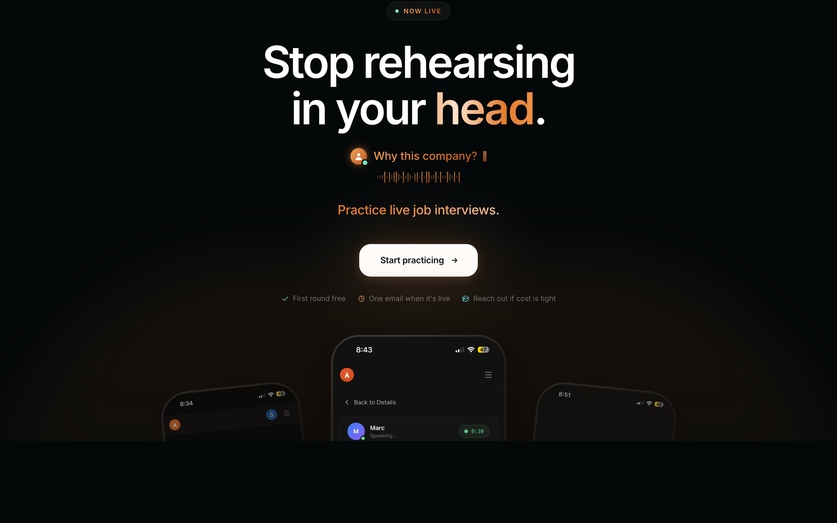
I rebuilt the Articulate landing page more times than I want to admit. Most of those changes were polish I could have skipped. Looking back honestly, only a few things actually moved the page, and none of them was a nicer gradient.
One honest line did the work
One honest line did more work than every animation stacked on top of it. "Everyone sounds better in their head" is not clever. It is just true, and people feel it before they finish reading it.
From there the copy got concrete, until the hero said exactly what you do instead of selling a vibe.
What made the copy work:
- It names the exact moment people dread, not a vague benefit.
- It uses the words a nervous person would actually use, not marketing words.
- It says what you literally do, so nobody has to guess.
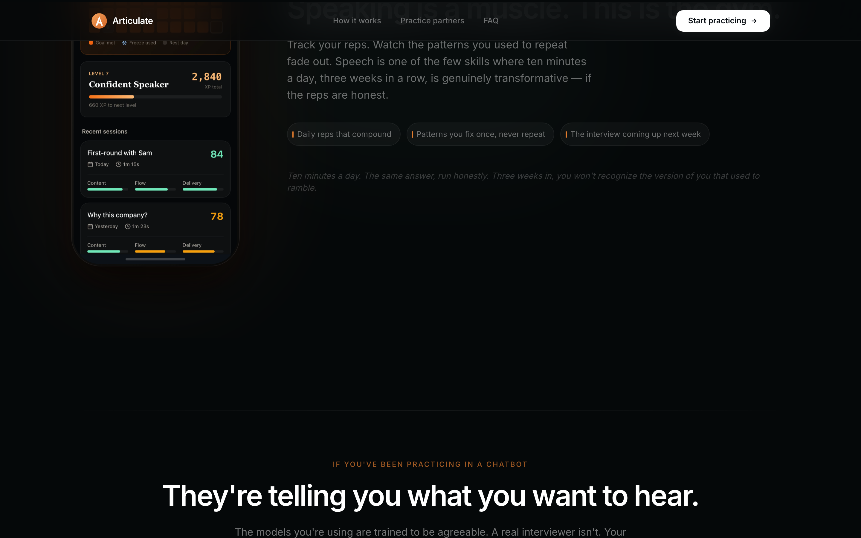
This was not my first landing page
A lot of what worked here I did not learn on Articulate. Before this I built websites for software companies in Pakistan, usually iterating live while the CEO watched and reacted. That is where I learned what actually holds attention: a typewriter effect that makes you wait for the next word, orange that pops against a dark background, and the hard rule that if you do not grab someone in the first five seconds, they never come back. I got to sit with a lot of founders, show them the page again and again, and cut anything that did not earn its place. That experience did most of the heavy lifting here.
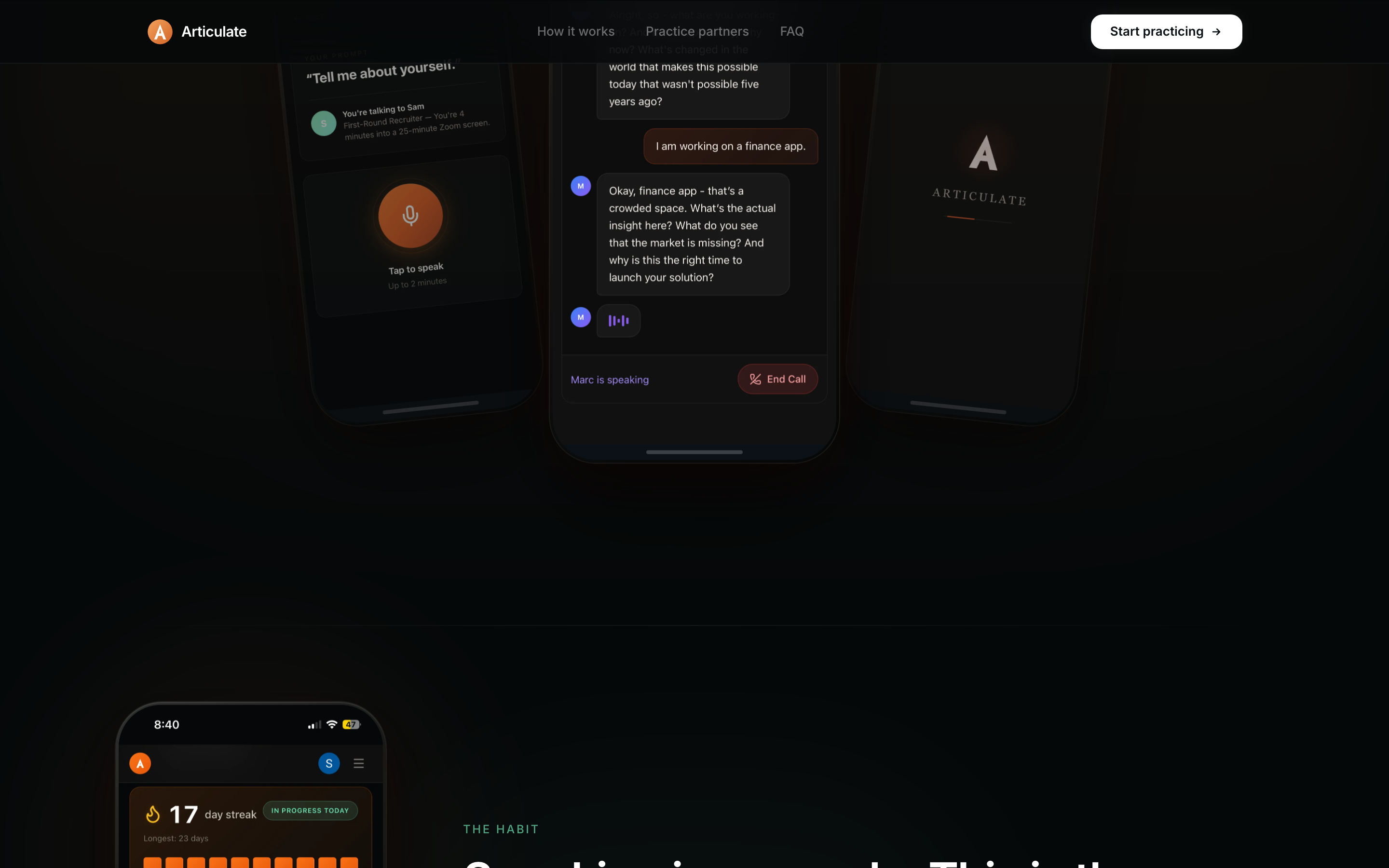
The unglamorous 80 percent
Scroll the commit history and most of it is not big redesigns. It is tiny, boring alignment work:
- Matching the "Start Recording" button to the hero buttons at exactly 48px on mobile.
- A softer glow on one button. An on-brand waveform loader instead of a generic spinner.
- Tighter spacing here, a rounded pill there.
- The pricing block: two cards, a monthly and annual toggle, annual shown first. How you show a price is part of the page's job, not a separate thing you hand off.
None of this is screenshot-worthy, and it is most of the job. A landing page is a hundred small decisions that add up to "this feels solid" or "this feels off," and no user can ever tell you which pixel did it. I checked it on a real phone and even an iPad, because "looks fine in dev tools" and "feels right in your hand" are two different things.
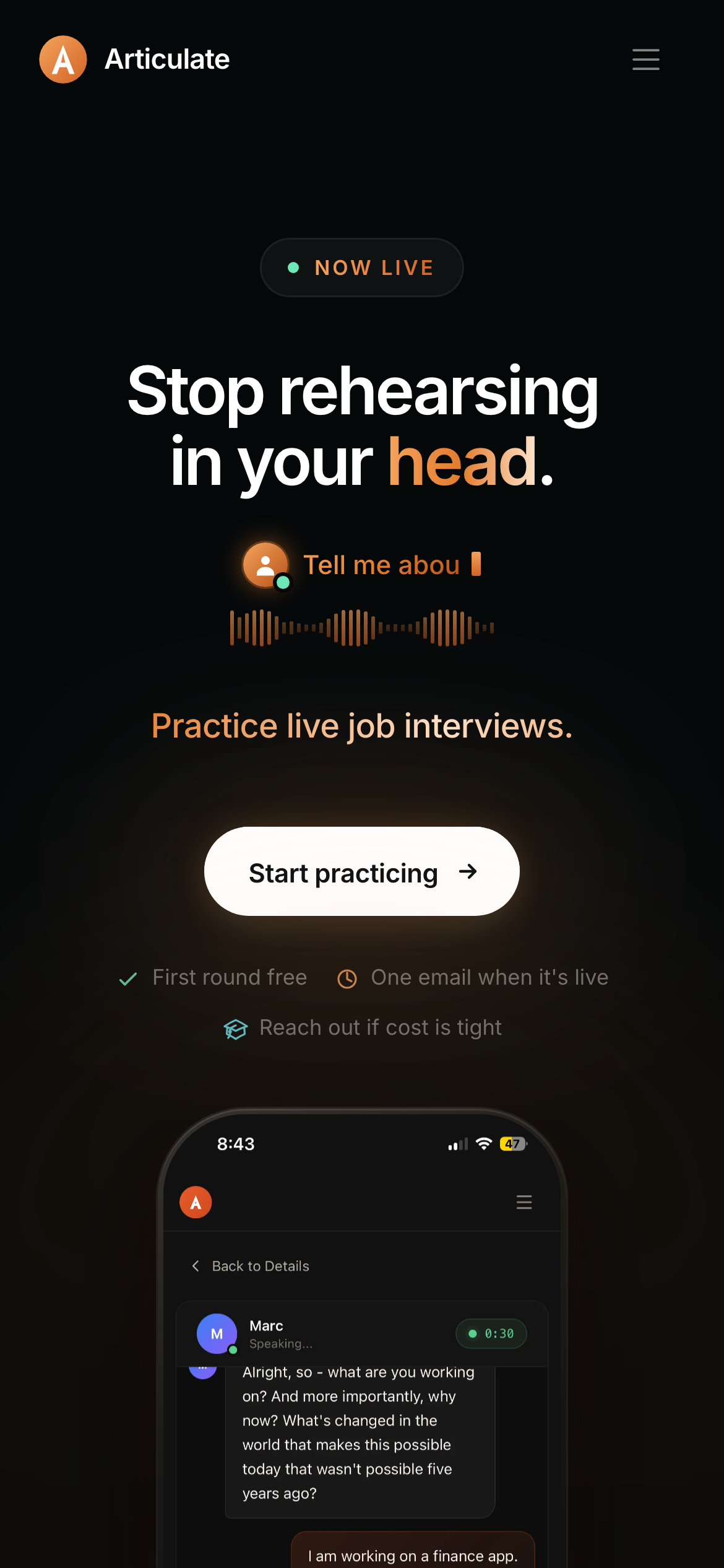
Get the sentence right before you touch the design. One true line beats any visual.
What I would tell another founder
- Copy first. Get the sentence right before you touch the design. You can keep changing it, but always have a plan for what goes where.
- Be specific. Name the exact moment your user dreads and skip the abstract benefit.
- Design mobile first. That is where "feels off" hides, and most of your visitors are there anyway.
- Treat pricing as part of the page, not a component you hand to someone else.
The boring stuff that still bites you
The copy and the feel are the fun part. The rest will still trip you up:
- Speed. Huge images quietly kill your load time. Learn to watch it.
- Analytics. Turn them on early so you learn from real users instead of guessing.
- Proof. Add real reviews the moment you have them.
- FAQs. Underrated. They answer the objection that was about to lose you the signup.
The page is live at articulatespeech.io. The fancy stuff came and went. The plain sentence stayed.
See it live.
The hero, the habit, and the interviewers that don't go easy.
Visit articulatespeech.io →